Friday, September 25, 2015

Journal #3

Sign for Salisbury Cycle & Fitness Bike Shop located on 1404 S Salisbury Blvd.  Image is a screen shot from the street view on Google Earth.

This sign incorporates the ideas we discussed in class about the sensation of bicycles when they first became popular among men and woman during the Art Nouveau period in the late 19th century. The image of the bike is paired with an Art Nouveau/Art Deco typeface, similar to the French and American advertisements for bicycles we looked at in class.


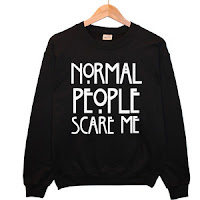
American Horror Story Typography
The typeface used for the TV show American Horror Story is Rennie Mackintosh ITC. Rennie Mackintosh attended the Glasgow School, in which he created a total design of art. In class we looked at his chair that was geometric, symmetric and elongated, much like his typeface. Rennie Mackintosh ITC works for American Horror Story for it's clean and timeless look from the Art Nouveau period. 

Friday, September 18, 2015

Journal #2

William Morris & Co. Honeysuckle and Tulip Wallpaper, brand new for $83.84. Found on Ebay from seller all-things-groovy. 

This wallpaper was designed by William Morris, an artist and designer from the Arts and Crafts movement. His wallpaper designs, as well as carpet and textiles gained popularity in the 19th century when people began to think about how home decor reflects personality. This idea that good design makes lives better is something that comes naturally to people today, yet it really started with Morris, Marshall, Faulker & co. I'm not sure of the exact date that this design was created but it proves that Morris' designs are  timeless - Ebay was full of his designs and I found this wallpaper very elegant and something I would have in my home. 


Godey's Lady Book: Design for Toilet Cushion and Bottle Cover.
Title: Christmas Gift for Ladies
Date: December, 1885
Publication: Godey's Lady Book
Location: Philadelphia, Pennsylvania

I chose this christmas gift because it incorporates many of the topics we went over in class this week. Following Britain's Industrial Revolution, magazines began to be available for everyday people to read, commonly in coffee houses. Godey's Lady Book was the first magazine directed towards women and how to incorporate design into their lives. This Christmas gift was advertised in the December 1885 edition, and included a laced satin toilet cushion and perfume bottle sachet, which reflects the idea I mentioned above about home decor becoming necessary in households. Also, the first image of the christmas card is similar to the Christmas card we saw in class by Prang & co. that used chromolithography. 


Friday, September 11, 2015

Journal #1

Front cover of The Offical Guide to Paris No. 1 from Spring 2012, published by Les Ă‰ditions Jalou in Paris, France. 
From the archives of Les Éditions Jalou, found on  http://patrimoine.editionsjalou.com

I chose this magazine cover because it features the Modern Roman typeface, Didot, which is used on many fashion magazines for it's neoclassical look. This cover also has Chinese type, which we looked at in class in Night Shining White, that had Chinese woodblock moveable type.


Vintage Printer Drawer for Woodblock Letterpress, $77.00. Found on Ebay from seller wehavituneedit.

This drawer is similar to the ones that we looked at in class, where the fonts are stored in two different cases to separate upper case from lowercase letters. These drawers have individual slots for each letter to keep them upright.  The seller didn't indicate what year these drawers are from, but they could date back as far as Guttenburg's time.