Friday, December 4, 2015

Journal #12

Exterior of Ikea 
Designed in Sweden 1943

           The architecture of Ikea stores consist of plain yellow and blue walls on a large geometric buildings. This is similar to the Mechanic Theatre in Baltimore designed by John A. Johnsen which reveals the buildings inner structure rather than making the outside pleasing to the eye, an idea known as "commercial vernacular". Both Ikea and the Theatre do not have windows, which makes the exterior as simple as possible. This is unlike the style that Best Products use using in 1977 that favored decoration, and had Hawaiian print on the outside of the building.


Friday, November 20, 2015

Journal #11

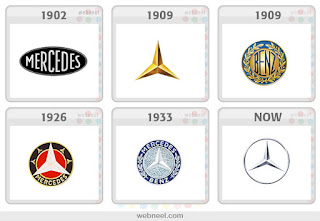
Mercedes-Benz Logo evolution 1902-Present Day
The evolution of the Mercedes-Benz logo is similar to the evolution of the NBC logo. The Mercedes-Benz logo transforms from just the word "Mercedes" to just the triangle symbol, similar to what we see today. From 1909 to 1933, the logo consisted of both the symbol and text, yet the current logo went back to the 1909 logo of just the symbol. The reason for the change to a silver symbol instead of the gold was that their first car was known as "the silver arrow". NBC's logo that we looked at in class followed a similar transformation. Their logo from 1956 had the image of a peacock with the rainbow colored feathers. This idea reappeared in 1979 and then was farther simplified in 1986 to the logo we see today that. Both logos change, and then go back to original ideas.    


Posters for Olivetti typewriters by Milton Glaser
Unknown date, but most likely from 1950s or 1960s
Found on ebay from seller planofinearts
These two posters by Milton Glaser advertise Olivetti typewriters. Glaser uses the same technique that Giovanni Pintori uses in his advertisment for the Olivetti Lettera 22 typewriter from 1952 and 1958. The use of color and line is used in Pintori's posters suggest that the typewriter is fun, youthful and easy to use. Glaser's posters use bright colors and balls to make the typewriter playful and youthful, similar to his posters for the Valentine typewriter that we saw in class that uses illustrations of young people to suggest that the typewriters are contemporary. 


Friday, November 13, 2015

Journal #10

M&M Facebook Advertisement 
Created by Mars Candy, 2010
This advertisement for pretzel M&Ms brings to life the M&M and the pretzel by giving them humanistic qualities. The use of personification in advertisements is also seen in George Lois' Wolfschimdt's Vodka Life Magazine ad from 1960. These weekly ads followed the story line of the vodka bottle and a fruit or vegetable having a humorous conversation, which is also used in the pretzel M&M advertisement. 

Superbad Intro credits
Produced by Judd Apatow 2008
The opening credits to the movie Superbad show the silhouette of the main actors, Michael Cera and Jonah Hill, dancing. The simplicity of just two colors, shapes and music as opening credits for a movie started with Saul Bass. His introductions for Psycho, North by Northwest, Mad Mad Mad World, and other Alfred Hitchcock movies. 

Thursday, November 5, 2015

Journal #9


Type used for the show Spongebob Squarepants
Nickelodeon 1999- 2015
The type used for the show Spongebob Squarepants is similar to what we looked at in class in Disney World's Enchanted Tiki Room and Trader Vic's. The culture of these places is made up to appeal to Americans, with a mix of Hawaiian, Polynesian, and Pacific Island influences. This style is attractive to people to give a tropical and beachy feel, yet it is not realistic. Spongebob uses this same idea with the creation of the fictional underwater town of Bikini Bottom that features graphics of Hawaiian flowers, Tiki designs, and typefaces that resemble what it used in the Enchanted Tiki Room. 
Pendleton Sportswear 
October 1959
found on Pinterest
This advertisement for Pendleton Sportswear from 1959 is similar to the Ohrbach's department store advertisements that we looked at in class this week. Both advertisements are image based- so the large block of text is necessary to read to get the complete information of what is being advertised. Here, the three women wearing the Pendleton Slim Jim skirts and sweaters represent high culture fashion, but shows that it is affordable for middle class women, just as the Ohrbach ad with the cat reveals. Also, there is this idea of competition and social status based upon fashion that is seen in both. The Ohrbach ad has the cat gossiping about other women and the same idea is portrayed here with the women laughing, linking arms, and seeming confident and above those who aren't wearing Pendleton Sportswear.  


Thursday, October 22, 2015

Journal #7


 Flo from Progressive Insurance commercials 
Portrayed by Stephanie Courtney
2008-present

Flo from the Progressive commercials is a fictional character used repeatedly for advertising. Earnest Elmo Calkins, the "Dean of Advertising," was the first to use a fictional character to advertise a product, during the time of American Modernism. Phoebe Snow, who wore all white, claimed that cleaner materials used for railroads would keep your clothes clean. Calkins created short poems to capture the audiences' attention, similar to how Flo uses her peppy and upbeat personality. This idea of using the same fictional character as a spokesperson for a product began with Calkin's Phoebe Snow and this idea is used today in many company's advertising. 


Apple iPhone 6
Released October 2014
Another idea introduced by Earnest Elmo Calkins that we discussed in class this week is the idea of planned obsolescence, that he referred to as "styling goods" or "consumer engineering", meaning people replace their belongings when fashion changes, rather than when things break. An example of this is the release of the iPhone 6 and iPhone 6 plus. People rushed out to get the larger phone just because it is a new style over phones with smaller screens, even if their current, smaller phone worked perfectly fine. We mentioned in class that this was also popular in the 1950s when appliances would come out in many different colors, and when they became out of style, people would upgrade to a different style before the appliance broke. 

Thursday, October 15, 2015

Journal #6


Hotel Cortez - American Horror Story Hotel
Directed by Ryan Murphy, 2015

On this week's episode of American Horror Story Hotel, the history of Hotel Cortez was revealed. It was built in 1925 by James Patrick Marsh, played by Evan Peters, and resembles characteristics of Art Deco and total design. The character is described as an "art deco freak, oil tycoon millionaire, and murder fetishist". He designed every aspect of the hotel - the architecture, carpeting, light fixtures, furniture, etc. even the sign outside has sans serif Art Deco type.  In class, we've seen Art Deco characteristics from the 1920's to 1930's when it was upcoming, as well as it's long lasting style that lingered into the Bauhaus School designs.


The White Stripes - Artwork for the album De Stijl from 2000

This White Stripes album titled De Stijl reflects aesthetic characteristics from the De Stijl movement that we studied in class this week, a combination of Synthetic Cubism, Constructivism, and Dada. This CD case uses lines, rectangles and a limited color palette of primary colors (red, white and black which are used in all White Stripes albums).  The simplicity of shapes is intended to appeal to everyone through it's abstraction, similar to Mondrian's work that we looked at in class - Tableau No. 2 with red, blue, black and gray from 1925. I find it interesting that Jack White, the band's lead singer chose this style for an album because their music alternative/punk rock and is far from simple and clean cut, like De Stijl. 


Friday, October 9, 2015

Journal #5


John Fredrick Peto, For the Track 1895, oil on canvas
Found in the National Gallery of Art in Washington DC.

This painting shows equipment for horseback riders in a barn, as well as bits of tickets and a flyer/poster in the center. This flyer, stating "Oakley Race Track Six Great Races", uses a woodblock typeface on the word "Oakley", which we looked at earlier in the semester. It also shows early characteristics of synthetic cubism, that began a few years following this painting. Picasso's synthetic cubism, as seen in his painting Still Life with Chairs Caning, uses different mediums and textures to create collages. Although Peto's painting is not physically collaged, it resembles one because of the overlapping objects.


Pret a Manger- Organic Coffee & Natural Foods Logo and Packaging.
Found in Washington DC

As seen in many restaurants today, Pret a Manger uses an Art Deco, Sans serif typeface. The popcorn bag uses this type as well and sticks to a limited color scheme of white, red and yellow. The bag itself is designed with vertical stripes, which is seen throughout Art Deco period of the 1920s and 30s in design and packaging.