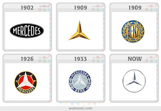
Mercedes-Benz Logo evolution 1902-Present Day
found on http://www.logodesignlove.com/
The evolution of the Mercedes-Benz logo is similar to the evolution of the NBC logo. The Mercedes-Benz logo transforms from just the word "Mercedes" to just the triangle symbol, similar to what we see today. From 1909 to 1933, the logo consisted of both the symbol and text, yet the current logo went back to the 1909 logo of just the symbol. The reason for the change to a silver symbol instead of the gold was that their first car was known as "the silver arrow". NBC's logo that we looked at in class followed a similar transformation. Their logo from 1956 had the image of a peacock with the rainbow colored feathers. This idea reappeared in 1979 and then was farther simplified in 1986 to the logo we see today that. Both logos change, and then go back to original ideas.
Posters for Olivetti typewriters by Milton Glaser
Unknown date, but most likely from 1950s or 1960s
Found on ebay from seller planofinearts
Found on ebay from seller planofinearts
These two posters by Milton Glaser advertise Olivetti typewriters. Glaser uses the same technique that Giovanni Pintori uses in his advertisment for the Olivetti Lettera 22 typewriter from 1952 and 1958. The use of color and line is used in Pintori's posters suggest that the typewriter is fun, youthful and easy to use. Glaser's posters use bright colors and balls to make the typewriter playful and youthful, similar to his posters for the Valentine typewriter that we saw in class that uses illustrations of young people to suggest that the typewriters are contemporary.


